Colour can be a powerful element in scrapbooking. The choice of colours used will convey the mood and tone of the layout.
Here are some basic rules that I've follow with regards to using colours.
1) Different colours convey different moods. Hence before I select my colours, I will look at my photo to determine what sort of mood I want to convey. Certain colours can evoke certain emotions e.g warm colours such as red or orange convey excitement and intensity. Cool colours such as blue or green suggest calmness or serenity.
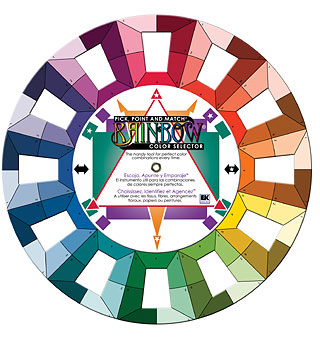
2) Deciding on a colour scheme. I've found that using a colour wheel has helped me greatly in determining the right colours to be used on a page. There are several approaches to colour schemes but here are some of the most common ones:
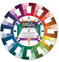
a) Monochromatic: various hues of the same colour
b) Analogous: adjacent colours on a colour wheel e.g. purple and blue or yellow and green
c) Complimentary: colours that are exactly opposite of each other on the wheel e.g. blue and orange
d) Triadic: any 3 colours that form a triangle on the wheel e.g. red, yellow and blue.
3) Measuring colours used. I found that by varying the amounts of hues on my page, this will make the colour scheme more effective. I follow the "Quart-Pint-Ounce Approach", using a quart as the main colour, a pint for the support colour and just a smattering ounce as accents.
4) Making colours pop. I've found that when I indulge in 2 or more colours in my layout, I either use a black or white cardstock as the base. Black tends to intensify the colours and give them dimension whereas white tend to soften the colours.
Here are some tips that I've found useful when playing with colours.
- If you are uncertain about experimenting with colours, then stick within a particular paper range/collection. These papers are usually design to colour coordinate with each other and apply the "quart-pint-ounce" approach.
- Take inspiration from catalogues, advertisements etc. These usually have brilliant colour combination to attract the customers. Take guidance from home decor magazines too. These usually showcase the latest colour designs.
-
If you have a colour scheme you would like to follow but the colours clash with the photo, then simply convert the photo into black and white using a photo imaging software.
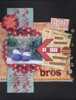
In creating this layout 'Bros In Arms', I noticed that green appeared to be the dominant colour in the photo. Looking at the colour wheel, I decided to go for a contrasting colour, orange then playing with the wheel, I realised I could add a smattering of red as an accent colour. Hence, I made use of the triadic colour scheme i.e orange, red and green, the colours that form a triangle on the colour wheel. I applied the "quart-pint-ounce" approach, using orange as the dominant colour, followed by green as a supporting colour and finally touching up with some red accents. The reds helped to convey the boys' defiant attitude while the other colours convey the playful mood I wanted to achieve.
Hence, don't be afraid to play with colours. If in doubt, consult the colour wheel to help choose colours combination that will give you a sense of balance in your page. Look for inspiration when you shop and jot down colour combinations that you see. But most of all have fun experimenting!


 And Bryan and the boys playing football in the snow in our front yard while I photograph from safely inside my warm dining room!
 We LOVE it here! The snow is great and I love the cold. The kids especially are really enjoying it! :)
 Our new home is 133 years old and so full of character. So many people have done so many AWFUL things to it while "decorating" ack! but we are here to rescue it!!!














 After using some Rhonna Farrer brushes from