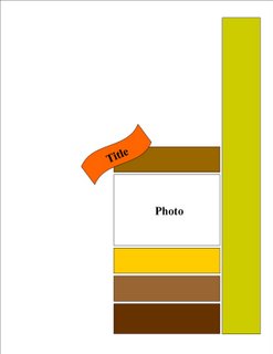
It's time for another 8.5x11" sketch and this time I thought I play with white spaces on the layout. I always feel that I need to fill up every space but decided to try the 'less is better' style. This is the sketch that I've come up with:
 And here's my interpretation of the sketch.


No comments:
Post a Comment