After I get all of these boxes out of here, I am going to start preparing for a scrapbooking garage sale this weekend!
If you're interested, I have almost $20,000 worth of supplies that I am going to be selling and you could take them ALL home! PLEASE take them all home! :) We are more than likely moving to another state next month and I need it all to be GONE!
The store location where we are having the sale is:
Dee Scrapbook Store
2012 Beacon Manor Drive, Fort Myers, FL, 33907.
You can always email me too if you have any questions.
Hope to see some of you there!
Thursday, November 30, 2006
Wednesday, November 29, 2006
 Have you checked out our font forum? Each week at least one new font is presented! Check out some of the newest ideas in lettering. And best of all- they are free! There are so many options that open up with fonts. You have one more outlet to expressing yourself! Why be limited to the same old rubons? Or chipboard that is only one size? Or maybe you don't have all the letters that you need? that's when fonts come in! Plus, we have dingbats to meet your cutting needs as well! So swing by-
http://www.homegrownscrapbooks.com/forums/tt.aspx?forumid=72 and as always- if you ever need a font submit a request! We'll do our best to help!
Wednesday, November 22, 2006
Happy Thanksgiving and the Doodle Genies are in the house!
I wanted to let you all know that after 3 months of waiting they are FINALLY HERE!!!! The Doodle Genies have arrived! And I am leaving... But I will be back! :)
We're leaving this evening for our Family Reunion in St. Augustine, Florida. We get together every other year for a bit to catch up and meet the new babies - 5 are debuting this year! :)
We'll be gone until Sunday, but starting Monday I will be frantically packing and shipping out the Doodle Genies you've all been waiting for! Please, please please be patient with me as I have over 500 orders to ship out and it is going to take some time. But I promise to get them out as soon as possible! I will update everyone when they have all shipped out so you can let the stalking begin! :) I've already alerted my PO that I'll be coming in every day after they close to drop off shipments because regular business hours will be crazy as Monday is one of the busiest postal days of the year!!!
I hope you all have a wonderful Thanksgiving and that you enjoy taking a break to count your blessings and be in the comfort of family and friends!
See you all next week!
Schemin' With Colour
Colour can be a powerful element in scrapbooking. The choice of colours used will convey the mood and tone of the layout.
Here are some basic rules that I've follow with regards to using colours.
1) Different colours convey different moods. Hence before I select my colours, I will look at my photo to determine what sort of mood I want to convey. Certain colours can evoke certain emotions e.g warm colours such as red or orange convey excitement and intensity. Cool colours such as blue or green suggest calmness or serenity.
2) Deciding on a colour scheme. I've found that using a colour wheel has helped me greatly in determining the right colours to be used on a page. There are several approaches to colour schemes but here are some of the most common ones:
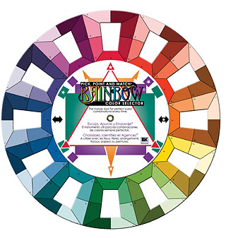
a) Monochromatic: various hues of the same colour
b) Analogous: adjacent colours on a colour wheel e.g. purple and blue or yellow and green
c) Complimentary: colours that are exactly opposite of each other on the wheel e.g. blue and orange
d) Triadic: any 3 colours that form a triangle on the wheel e.g. red, yellow and blue.
3) Measuring colours used. I found that by varying the amounts of hues on my page, this will make the colour scheme more effective. I follow the "Quart-Pint-Ounce Approach", using a quart as the main colour, a pint for the support colour and just a smattering ounce as accents.
4) Making colours pop. I've found that when I indulge in 2 or more colours in my layout, I either use a black or white cardstock as the base. Black tends to intensify the colours and give them dimension whereas white tend to soften the colours.
Here are some tips that I've found useful when playing with colours.
- If you are uncertain about experimenting with colours, then stick within a particular paper range/collection. These papers are usually design to colour coordinate with each other and apply the "quart-pint-ounce" approach.
- Take inspiration from catalogues, advertisements etc. These usually have brilliant colour combination to attract the customers. Take guidance from home decor magazines too. These usually showcase the latest colour designs.
- If you have a colour scheme you would like to follow but the colours clash with the photo, then simply convert the photo into black and white using a photo imaging software.
In creating this layout 'Bros In Arms', I noticed that green appeared to be the dominant colour in the photo. Looking at the colour wheel, I decided to go for a contrasting colour, orange then playing with the wheel, I realised I could add a smattering of red as an accent colour. Hence, I made use of the triadic colour scheme i.e orange, red and green, the colours that form a triangle on the colour wheel. I applied the "quart-pint-ounce" approach, using orange as the dominant colour, followed by green as a supporting colour and finally touching up with some red accents. The reds helped to convey the boys' defiant attitude while the other colours convey the playful mood I wanted to achieve.
Hence, don't be afraid to play with colours. If in doubt, consult the colour wheel to help choose colours combination that will give you a sense of balance in your page. Look for inspiration when you shop and jot down colour combinations that you see. But most of all have fun experimenting!
Tuesday, November 21, 2006
Doin' It Digi!
Have you tried digital scrapbooking yet? It is soooo much fun, though I can admit that for me, taking that first step was a bit intimidating. Now that I've ventured there, I love it, of course I'm not ready to ditch my paper and glue just yet!
If you are a beginner or you haven't done a digital page yet, here's a project to get your feet wet. With the holidays just around the corner, I thought I'd show you how to make your own custom card. This one is pretty basic. You could certainly make it fancier. That's the beauty of digital -- you can always undo something if you don't like it!

First, let's begin with a 4x9 blank page at 300 pixels per inch. I'm using Adobe Photoshop Elements 5.0. After creating my 4x8 blank canvas, I'm going to add my background paper. I chose a paper from the Shappy Shoppe that I already had in my digi stash, opened it, and dragged it onto my blank canvas. I did recolor it a bit by going to Enhance-Adjust Color-Adjust Hue/Saturation and playing with the sliders until it looked the way I wanted it.
If you are a beginner or you haven't done a digital page yet, here's a project to get your feet wet. With the holidays just around the corner, I thought I'd show you how to make your own custom card. This one is pretty basic. You could certainly make it fancier. That's the beauty of digital -- you can always undo something if you don't like it!
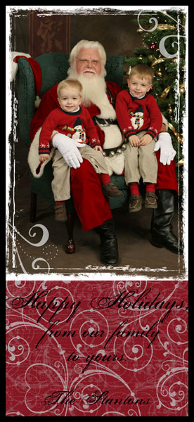
First, let's begin with a 4x9 blank page at 300 pixels per inch. I'm using Adobe Photoshop Elements 5.0. After creating my 4x8 blank canvas, I'm going to add my background paper. I chose a paper from the Shappy Shoppe that I already had in my digi stash, opened it, and dragged it onto my blank canvas. I did recolor it a bit by going to Enhance-Adjust Color-Adjust Hue/Saturation and playing with the sliders until it looked the way I wanted it.
As for the photograph, I selected the photo I wanted to use for the card and decided I wanted to do something special with it. I referred to a tutorial on masking layers in Jessica Sprague's old blog. It's under Photoshop Friday Issue #3 and so is the grunge mask/frame that I used. You can download it for free. Here's what my photo looked like after following her tutorial:
 After using some Rhonna Farrer brushes from Two Peas In A Bucket , I dragged my background paper layer and then my photo onto my blank canvas and adjusted it to get this:
Then it was time to add my text. I put a holiday greeting and signature in a font called Porcelain. I played around with Drop Shadows and Bevels to try to get the text to stand out and even tried changing the opacity of the background, but didn't have much luck. Then I realized the text stands out just fine when I view the card at 100% instead of small like you see here. So, this was my final flattened version of a basic card (I added the black border just so it didn't fade into the background of the blog, but the black is not actually part of the card):

For more about digi scrapping and some great digital tutorials, I would recommend Two Peas In A Bucket and Jessica Sprague's blog. There are many other resources out there, but those two are my favorites and I would recommend them to anyone!
Monday, November 20, 2006
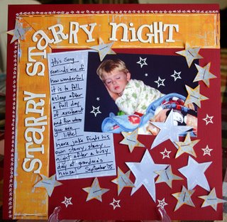
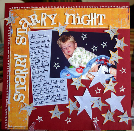
Sketching keeps your ideas safe!!
...At least that is what sketching does for me!! Keeps those fleeting ideas that pop in and out of my head safe and sound! Here is a quick sketch I did of an idea that came to me when I received the Homegrown October Hybrid kit...I loved that one of the Imaginisce patterned papers had stars featured on it...and I just knew I had a digital photo of Jake sleeping tucked away somewhere on the computer. I roughly sketched my idea out in a composition book. I also tend to write down ideas, patterned papers I have in mind, certain embellishments or techniques also. I was about to get to this sketch within a week or two of drawing it up, but sometimes it has been literally months until my ideas come to life!
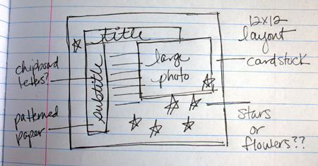
This 12x12 layout is what became of that idea and sketch I jotted down! I used Homegrown's October Hybrid kit and added a few embellishments from the August Hybrid kit, like the Cherry Arte star rubons (perfect!!!) and the Heidi Swapp chipboard letters to finish up the title. I love to see the variations I will come up with as I actually create the layout!
 So are you getting ideas at odd times like I do?? :) Just grab a piece of scratch paper or your journaling notebook and quickly sketch them out and they will be safely tucked away safe and sound!!
 So are you getting ideas at odd times like I do?? :) Just grab a piece of scratch paper or your journaling notebook and quickly sketch them out and they will be safely tucked away safe and sound!!
Christmas tree cards
 A couple of Christmas tree cards. The first was cut using my Craft Robo- though if you have the patience you could probably print the design in reverse on the back of the card and cut it with an Xacto knife. The second card I used leftover scraps! I took a larger piece of scraps and cut it into a triangle and then cut one inch strips. You could even use coordinating papers as well to make your tree! Happy Holidays!
Transparency Christmas cards
 This year I thought I would play with the large box of transparencies I had sitting in the cabinet from last years stint with transparencies on layouts! It's not a difficult process at all- just takes a little bit of planning. The first thing you need to do is cut your transparency to size and fold in half. Find those old college text books or phone books and stack them on top to flatten the fold. Then decide on your image. I cut this tree with my craft robo though it wouldn't be hard to hand cut. The tree is attached with herma dots on the back as well as the brads spaced throughout. The white ribbon knots are glued on with diamond glaze. I took a second tree and placed it underneath the original tree and used white acrylic paint to create a shadow on the inside page. That is where I will add my message! Add a transparency envelope and voila! You have a lovely Christmas card!
Happy Holidays everyone!
Friday, November 17, 2006
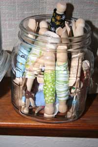
Get it Together!! ~Organizational Tip
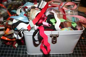
I LOVE ribbon! Seriously, love it. And yet, I never seem to use it up as quickly as I procure it, which leaves me with massive amounts of ribbon all over the place, with very little organization. I’ve read about a neat way of taming the ribbon explosion that I have in boxes and tins, and recently decided to start tackling this project.
You will need a handful of wooden clothespins for this organizational project, the kind that look like miniature dolls.
Start by inserting the end of one of your loose pieces of ribbon into the slot on the bottom of the wooden clothespin.
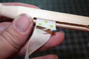
Then, begin winding the ribbon around the base of the clothespin until you reach the end of the ribbon.
Use a straight pin and pin the ribbon together so that the end of the ribbon does not come loose.
Finally, pop all of your cute little ribbon spools into a big glass jar, or even back into the box that you had them in before. They not only look cute, but it is also easier to find a particular ribbon, and it really doesn’t take up that much more space than the ribbon explosion that I had before.
The Answers to the Reveal!
Okay I have to type fast as today is Mom's Morning Out and I have about 10,000 appointments this morning, but I will come back and post images this afternoon, and the kits will go up for general sale today! :)
Without further ado:
1. (Hybrid) This holiday staple will be the centerpiece at our Hybrid Kit's Christmas Table. BASIC GREY FRUITCAKE!
2. (Hybrid) No champagne needed to bring out the flavor is this glitzy tool! STRAWBERRY GLITTER GLAZE - LI'L DAVIS DESIGNS
3. (Trilogy) Visions of ______ danced in their heads... SUGAR PLUM - BUT NOT BASIC GREY! HEIDI GRACE FLOCKED AND GLITTERED!!!! (www.heidigrace.com)
4. (Trilogy) If you're going to the TomKat wedding this weekend, make sure to try this delicious sweet treat Italy made famous! GELATTO - PRIMA GELATTO FLOWERS!
5. (Trilogy) The Urban Dictionary defines this as "The term _______ refers to the imaginary "sound" that is produced from light reflected by a diamond." BLING - BAZZILL BLING CARDSTOCK IN BOTH KITS (HYBRID & TRILOGY)!
6. (Trilogy) Find a product with this title: "I didn't realize you were cool until..." KNOCK KNOCK STICKIES - 3 VARIETIES ACTUALLY!
7. (Hyrbid) According to legend, these were once used to treat fevers, and are known as the Flores de Noche Buena, or "Flowers of the Holy Night." POINSETTIAS - IMAGINISCE RED AND CINNAMON
8. (Trilogy) A type of paper commonly used to wrap packages for shipping. KRAFT - MAKING MEMORIES KRAFT PATTERNED PAPER AND STICKERS AND BAZZILL KRAFT CARDSTOCK
9. (Trilogy) What is being described here? "Place a small amount on the brush and gently tap off any excess. Look in the mirror and smile. Place on the apple of your cheek and gently brush upward." BLUSH - BASIC GREY BLUSH LINE
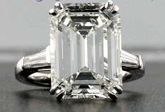
10. (Trilogy) The type of cut shown here: EMERALD! THERE WILL BE AN ASSORTMENT OF RUBY AND EMERALD RHINESTONES!
HOPE YOU'RE EXCITED TO SEE THOSE KITS NOW!
Without further ado:
1. (Hybrid) This holiday staple will be the centerpiece at our Hybrid Kit's Christmas Table. BASIC GREY FRUITCAKE!
2. (Hybrid) No champagne needed to bring out the flavor is this glitzy tool! STRAWBERRY GLITTER GLAZE - LI'L DAVIS DESIGNS
3. (Trilogy) Visions of ______ danced in their heads... SUGAR PLUM - BUT NOT BASIC GREY! HEIDI GRACE FLOCKED AND GLITTERED!!!! (www.heidigrace.com)
4. (Trilogy) If you're going to the TomKat wedding this weekend, make sure to try this delicious sweet treat Italy made famous! GELATTO - PRIMA GELATTO FLOWERS!
5. (Trilogy) The Urban Dictionary defines this as "The term _______ refers to the imaginary "sound" that is produced from light reflected by a diamond." BLING - BAZZILL BLING CARDSTOCK IN BOTH KITS (HYBRID & TRILOGY)!
6. (Trilogy) Find a product with this title: "I didn't realize you were cool until..." KNOCK KNOCK STICKIES - 3 VARIETIES ACTUALLY!
7. (Hyrbid) According to legend, these were once used to treat fevers, and are known as the Flores de Noche Buena, or "Flowers of the Holy Night." POINSETTIAS - IMAGINISCE RED AND CINNAMON
8. (Trilogy) A type of paper commonly used to wrap packages for shipping. KRAFT - MAKING MEMORIES KRAFT PATTERNED PAPER AND STICKERS AND BAZZILL KRAFT CARDSTOCK
9. (Trilogy) What is being described here? "Place a small amount on the brush and gently tap off any excess. Look in the mirror and smile. Place on the apple of your cheek and gently brush upward." BLUSH - BASIC GREY BLUSH LINE
10. (Trilogy) The type of cut shown here: EMERALD! THERE WILL BE AN ASSORTMENT OF RUBY AND EMERALD RHINESTONES!
HOPE YOU'RE EXCITED TO SEE THOSE KITS NOW!
Thursday, November 16, 2006
Homegrown Photo Shoot


I already posted these photos in the forum, but I started thinking that a homegrown photo shoot might be something everyone would be interested in - especially now with all of the fun Christmas clothes and props available!
So I thought I would show you a behind-the-scenes photo from the end of the shoot - after she had pulled up the shirt she was sitting on so that the white sheet below was showing.

I have a large piece of black cloth that I would normally use, but since I couldn't find it, I pulled out a black shirt and shirt and a black pair of pants and situated them so that (hopefully) you couldn't tell what it was. I put the white sheet below the black so that the light reflecting off the white sheet would make up for the black cloth absorbing the light around Delainey.
Simple, fast and fun! This whole "shoot" was 10 minutes start to finish!
So grab a black sheet and create some fun outtakes of your own this season! And don't forget the blurry pics and the outtakes - they are always some of my faves!


The challenge of revealing the December kit...
It's that time! We're ready to reveal the December kits and I'm going to make a BLOG CHALLENGE out of it for those of you playing Project Homegrown!!!
So here's the challenge - you have to reveal the kits!
Answer the following questions correctly and you will do just that!
1. (Hybrid) This holiday staple will be the centerpiece at our Hybrid Kit's Christmas Table.
2. (Hybrid) No champagne needed to bring out the flavor is this glitzy tool!
3. (Trilogy) Visions of ______ danced in their heads...
4. (Trilogy) If you're going to the TomKat wedding this weekend, make sure to try this delicious sweet treat Italy made famous!
5. (Trilogy) The Urban Dictionary defines this as "The term _______ refers to the imaginary "sound" that is produced from light reflected by a diamond."
6. (Trilogy) Find a product with this title: "I didn't realize you were cool until..."
7. (Hyrbid) According to legend, these were once used to treat fevers, and are known as the Flores de Noche Buena, or "Flowers of the Holy Night."
8. (Trilogy) A type of paper commonly used to wrap packages for shipping.
9. (Trilogy) What is being described here? "Place a small amount on the brush and gently tap off any excess. Look in the mirror and smile. Place on the apple of your cheek and gently brush upward."
10. (Trilogy) The type of cut shown here:
"Betcha' Didn't Think Of . . . "
Ok maybe you did. LOL But I still have to share this...Just in case!
I love Chipboard Alphabets. Especially the one in September's Hybrid Kit. The K&Co Addison Chipboard Alphabet is yummy!
But like all the other alphabets, there is never enough letters. Most of the time, you have to buy more than one set to get the letters you need. And that can get pricey!! Very Pricey!!
So, instead of doing that, I cut the alphabets up to make the letters I need.
Like in this layout. I needed three "C's" for the title. I only had two in the set. So, I took a "G" and made it into a "C"
I have also turned a "Z" sideways to make a fat "N". Trimmed the "Q" to make an extra "O".
Almost all the letters can be "altered" to make the letters you may need. Possibilities are endless. And not only with this save you some frustration, it will definitely save you money!
Wednesday, November 15, 2006
Say What? - Journaling Tips
I have to admit, this is a tough topic for me. I am not a writer. I am a facts type of person! Yet, I think it is important to tell the story behind the pictures. If you read Lori Gentile’s post here some weeks ago- about how to go beyond the pictures, I would say that was a great post, with fantastic tips.
In this post, I will highlight how we can incorporate parts of us (the scrapbooker) into the pages we do about our subjects (in my case, my children).
I really do not like to do pages about myself. But yet, it is important to pass on something about yourself, your qualities, and your life to your children. Very often, I will see my children doing something that reminds me of a characteristic of my own. So why not incorporate that into your journaling. Tell them a little about themselves, and try to tell a little about you, all in the same story.
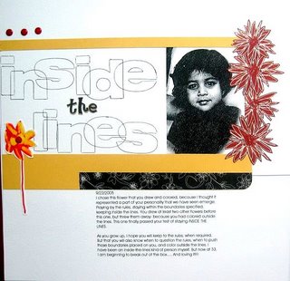
Here is an example about what I am talking about. My daughter (3 at that time) had just started drawing and coloring. I used the flower she drew as a metaphor of what we have seen as a characteristic of hers. She kept drawing and coloring, till she was happy that she had a flower in which she had colored inside the lines. That symbolizes how much she is rule-type of person. Very much like me! It took me a long time to start playing a little outside the rules. Not breaking them, but pushing the limits and trying different things. I tell her that in the journaling, and my advice to her, is to play by the rules when she must. But to also question boundaries and limits placed on her. The picture of her is one of those ChuckeCheese ones! The random picture you never know what to do. Use them for “moments” layouts like these!
In this post, I will highlight how we can incorporate parts of us (the scrapbooker) into the pages we do about our subjects (in my case, my children).
I really do not like to do pages about myself. But yet, it is important to pass on something about yourself, your qualities, and your life to your children. Very often, I will see my children doing something that reminds me of a characteristic of my own. So why not incorporate that into your journaling. Tell them a little about themselves, and try to tell a little about you, all in the same story.
Here is an example about what I am talking about. My daughter (3 at that time) had just started drawing and coloring. I used the flower she drew as a metaphor of what we have seen as a characteristic of hers. She kept drawing and coloring, till she was happy that she had a flower in which she had colored inside the lines. That symbolizes how much she is rule-type of person. Very much like me! It took me a long time to start playing a little outside the rules. Not breaking them, but pushing the limits and trying different things. I tell her that in the journaling, and my advice to her, is to play by the rules when she must. But to also question boundaries and limits placed on her. The picture of her is one of those ChuckeCheese ones! The random picture you never know what to do. Use them for “moments” layouts like these!
Tuesday, November 14, 2006
"Picture This" - Photographing Layouts
Let's talk about photographing our layouts. I prefer to photograph my layouts instead of scanning them for uploading to my scrapbooking sites. There is a trick or two to doing it well. Let's go over some basic rules:
1. Do not stand over your layout and photograph
2. Do not put your layout in direct sunlight and photograph
3. Do not use your camera's flash - EVER
So, what should you do?
1. Get your layout at eye or tripod level. I tape my layouts to the wall to shoot them. I use basic scotch tape because it doesn't hurt the paint on my walls or my layouts when I remove the tape. You want to put some tape at all four corners and place it on the wall at eye level. If you have a tripod, then place it at tripod level. This helps you shoot your image as straight on as possible and without shadows. It's impossible to stand over a layout and shoot it straight without getting some sort of shadowing.
2-3. You never want to use your flash or direct sunlight to photograph a layout. It will cause glare, shadows and make the color wash out. I recommend using a low light lens, I love my 50mm, and putting your layout on a well lit wall that is not in direct sunlight. You will want to allow as much light as possible into your lens, so use a low aperture. If you have a home that has little light during the day, you can shoot your layouts outside. The best times are early morning or late afternoon because the light is softest. Find a wall on the outside of your home that isn't in direct light and hang your layout there to shoot.
The last and most important part of photographing your layout is the editing process. I have two quick tips for photoshop users (I only know photoshop, but if you know another program feel free to comment on how to do these tips in that program.)
1. There is a nifty little feature called "perspective". You want to click in the box and "check mark" this tool. What this does when cropping an image, is allow the crop lines to bend. You will be able to move each corner of the crop box to fit each edge of your layout exactly. Do this on all four corners, then hit return and you will have a perfectly straight image with no background.
2. A quick way to fix color on a layout is to use your "auto contrast" feature. With your image open, click on "image", then on "adjustments", then on "auto contrast". This will sharpen up your image and help the colors pop. There are much better ways to do this, but for a quick fix, this works well.
Be sure to take lots of pictures of your layouts and practice. It's fun, quick and easy.
Monday, November 13, 2006
A sketch & a quote
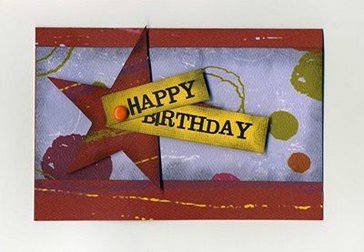
The secret of an enjoyable birthday
can be found in acheiving balance...
cake, ice cream, cake, ice ceam , cake...
Happy Birthday!

Subscribe to:
Posts (Atom)


